 |
COVID-19 Analysis |
|
COVID-19 Analysis |
The Latest Graphs
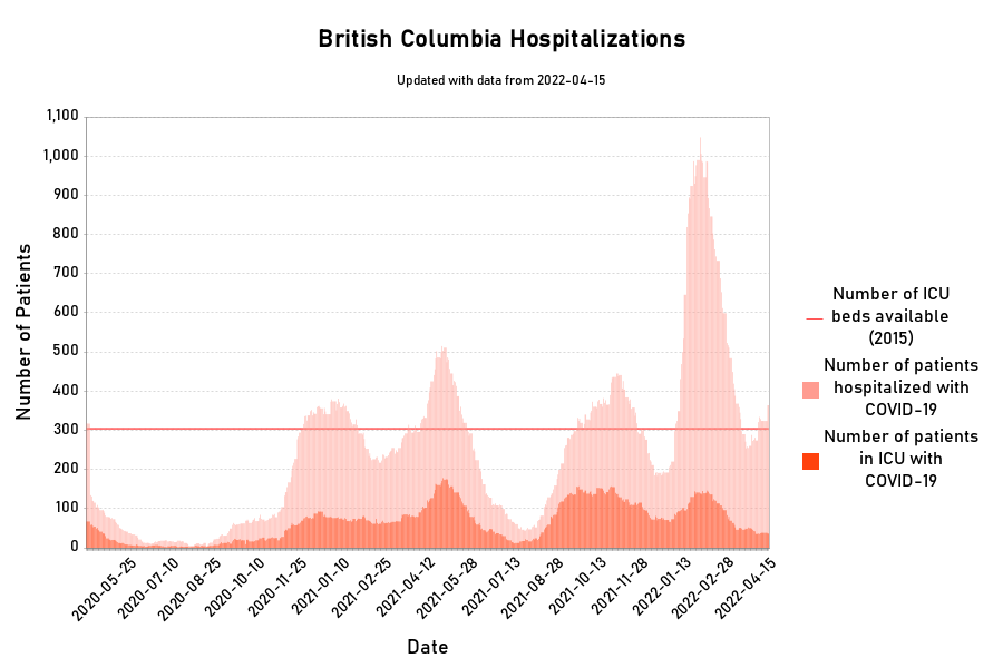
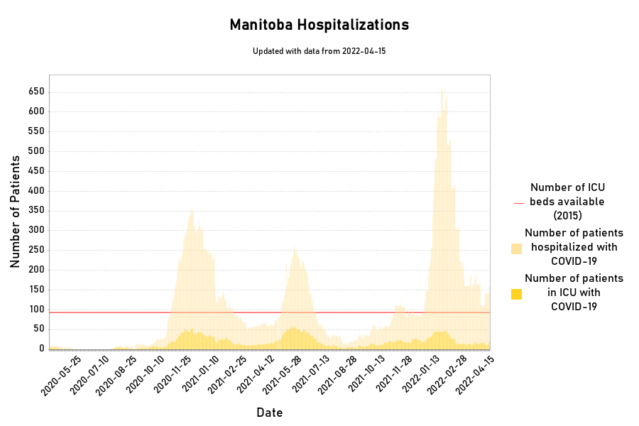
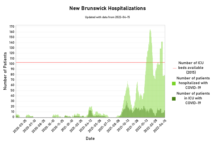
Provincial/City Hospitalisations
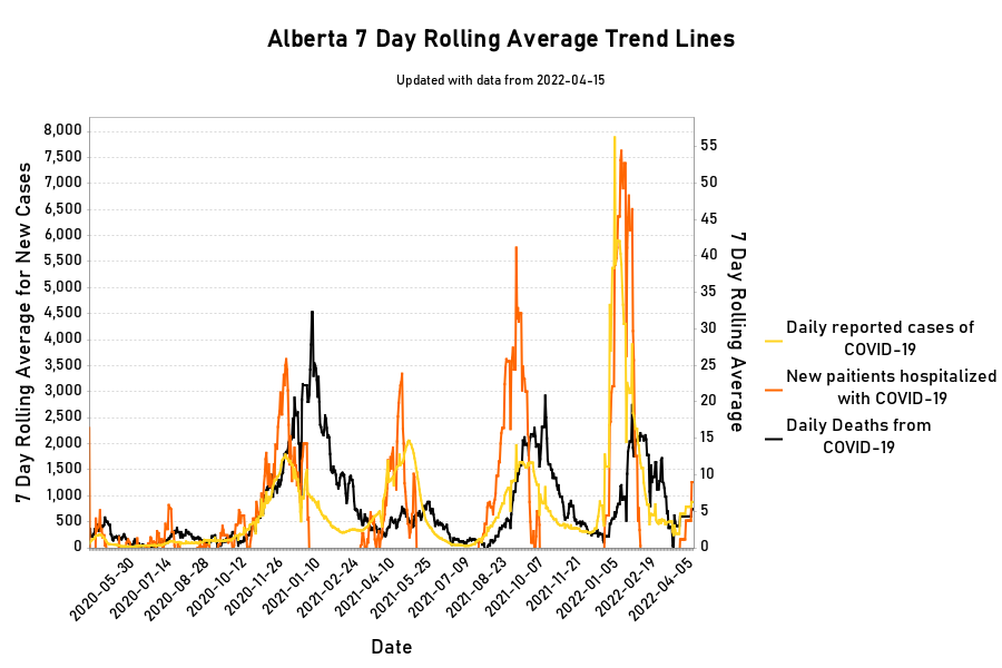
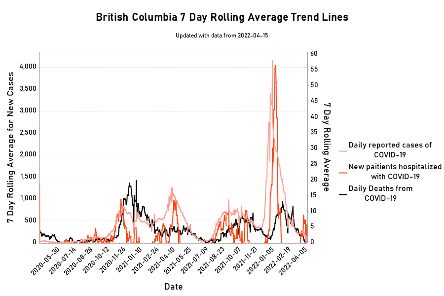
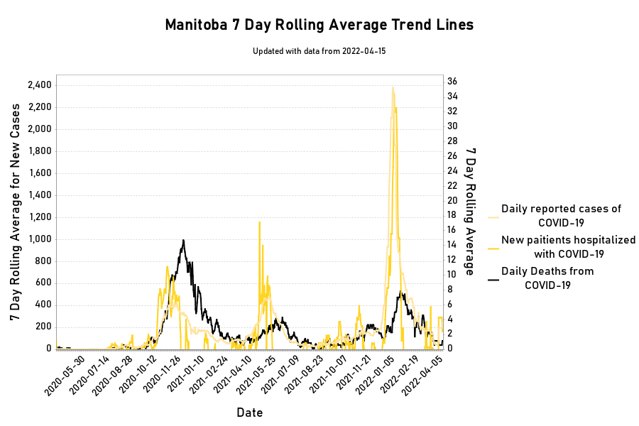
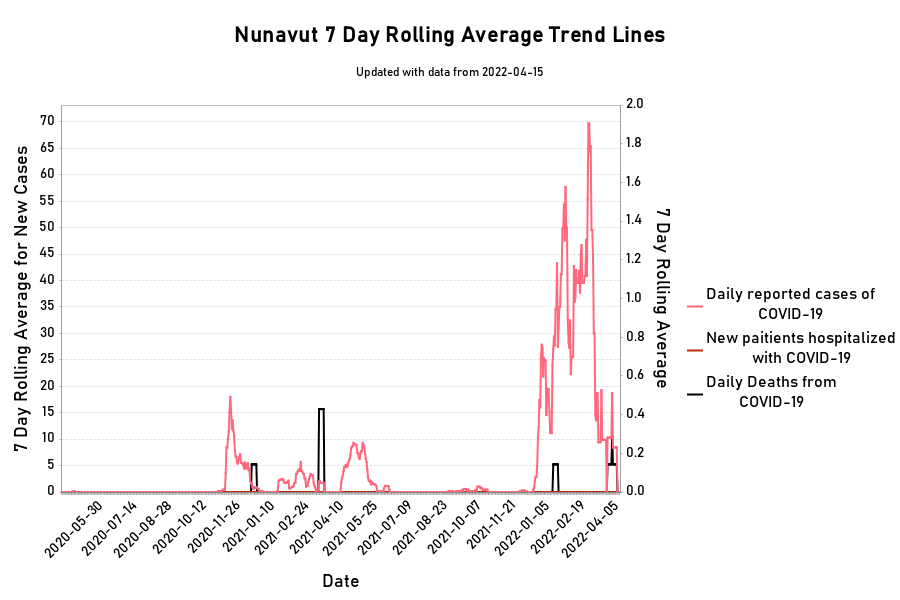
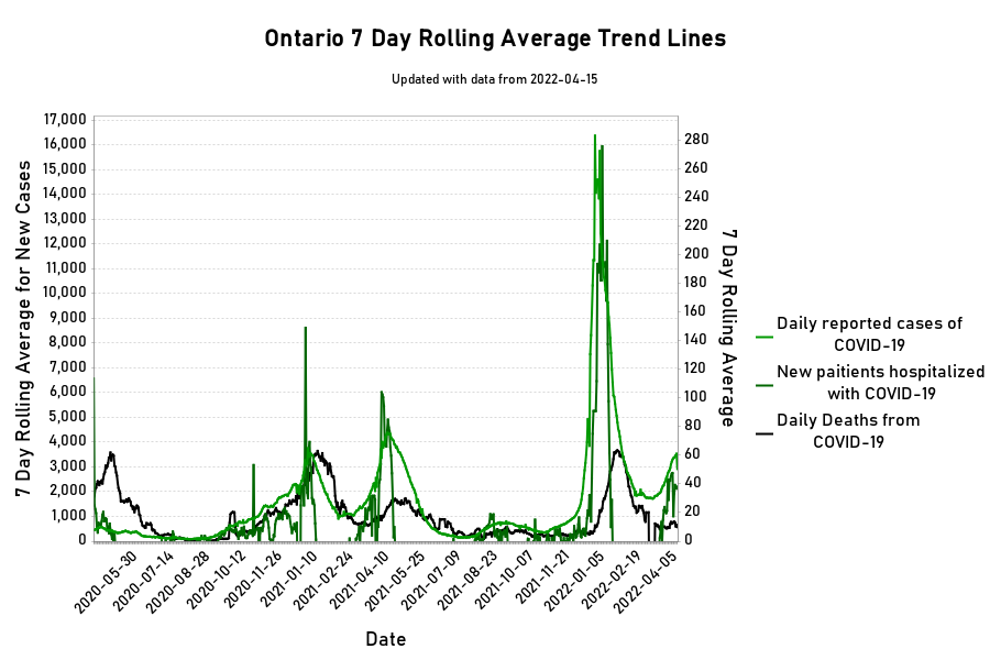
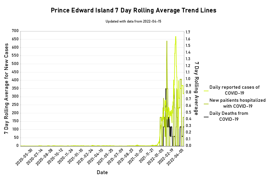
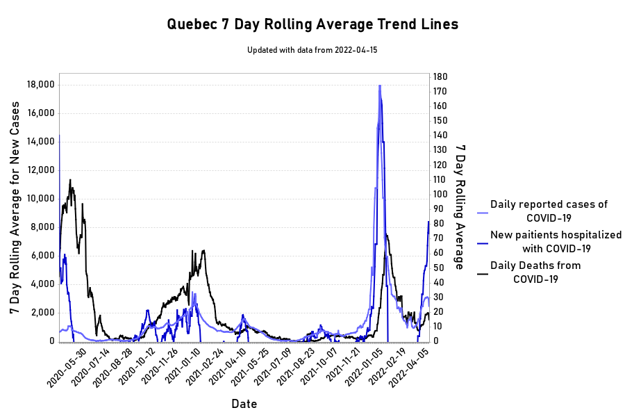
Provincial Trends
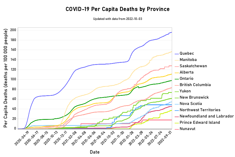
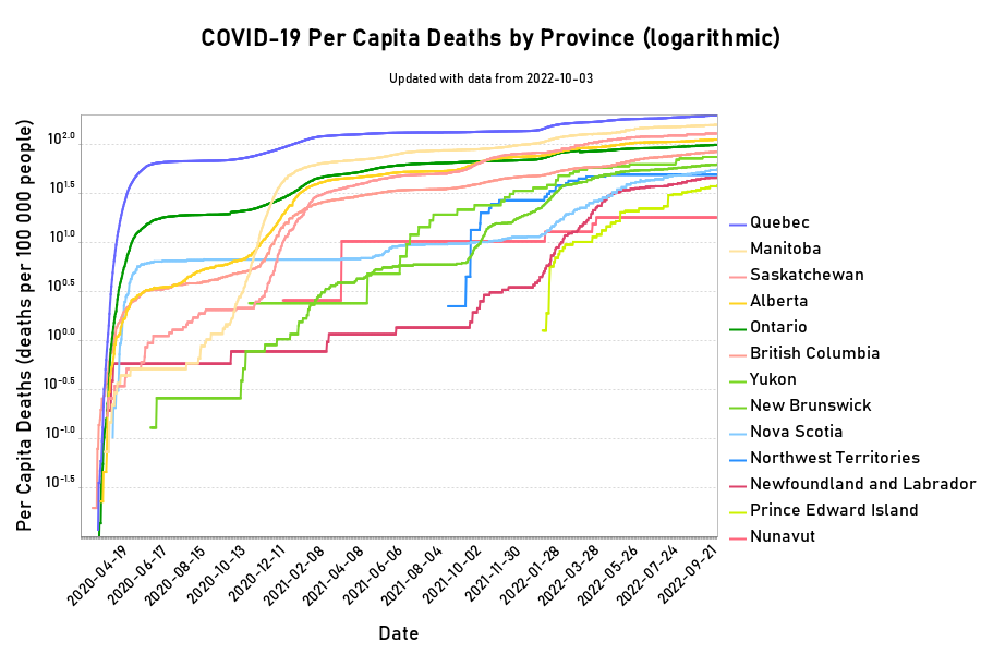
Provincial Per Capita Deaths
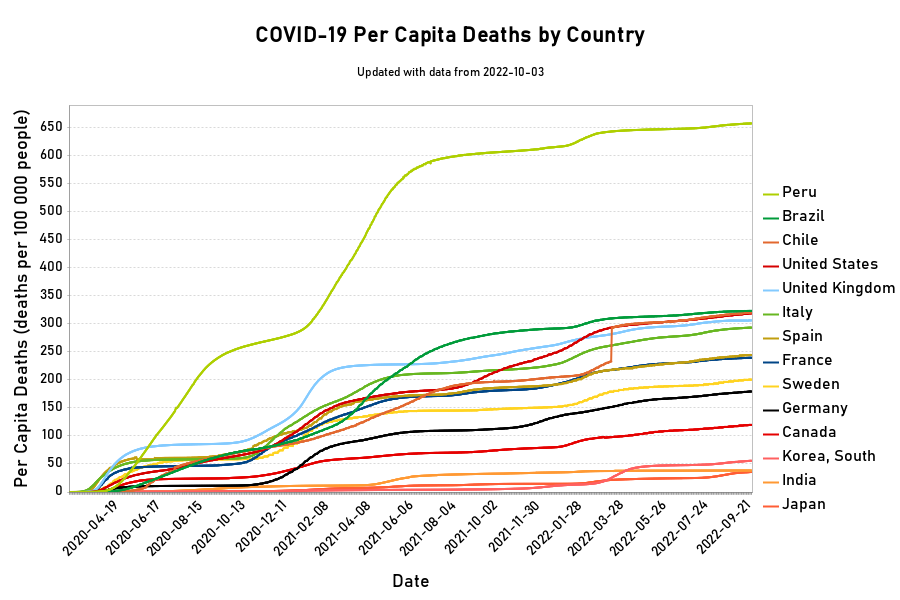
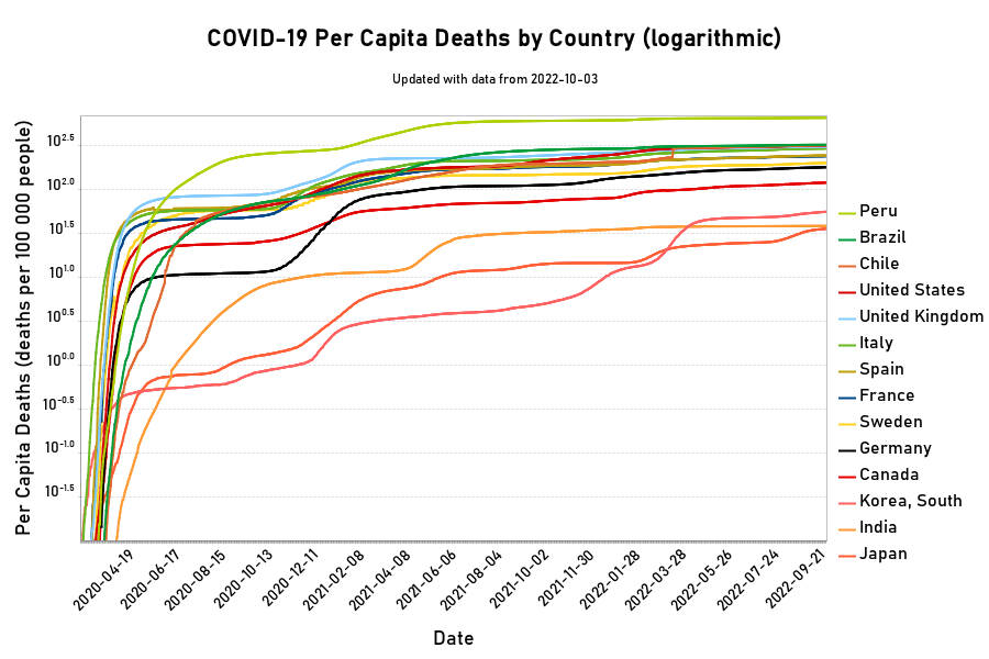
Selected Country Per Capita Deaths
Updates
Analysis and Discussion
Sources
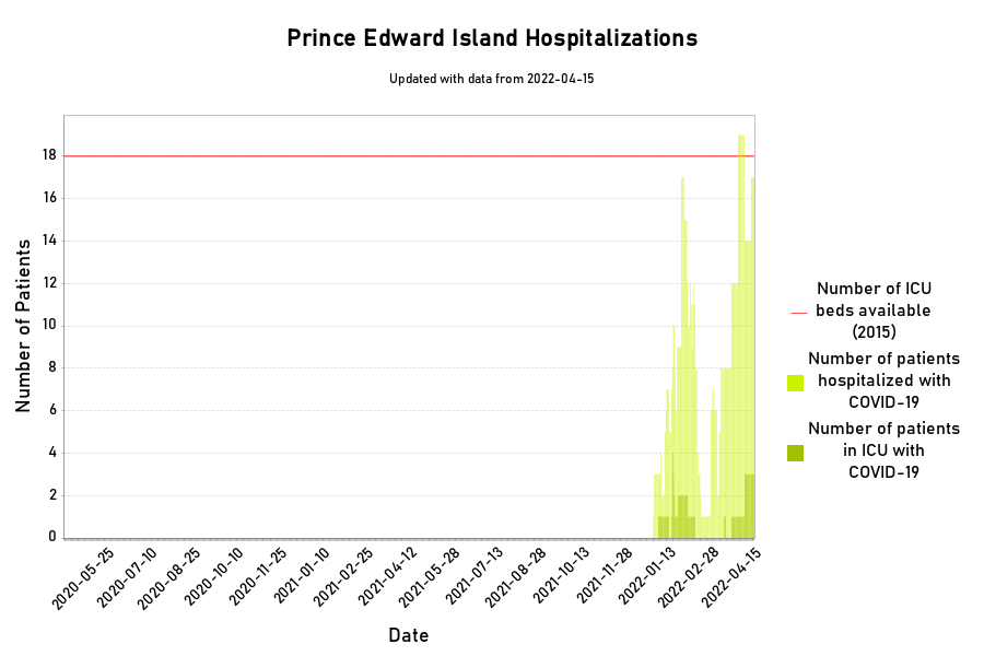
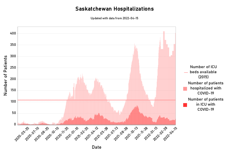
Hospitalisation data for the Canadian Provinces and The City of Ottawa
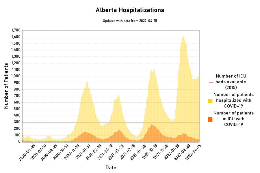
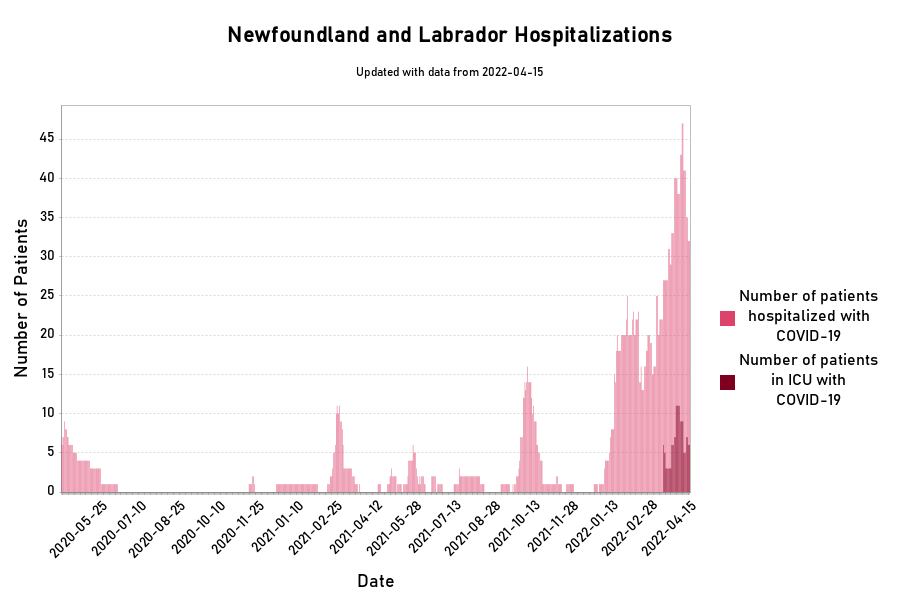
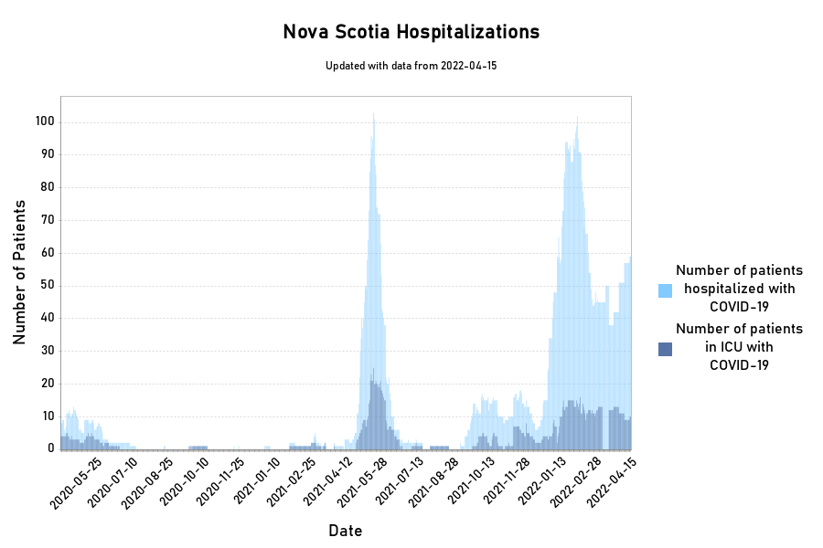
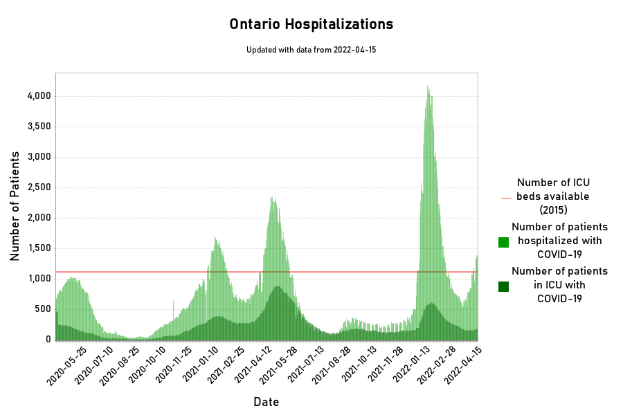
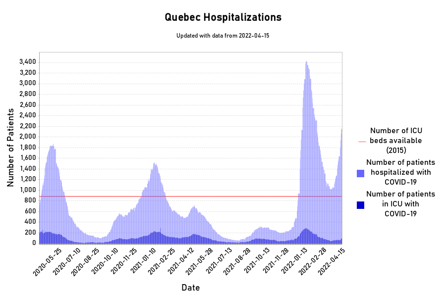
Please note the Quebec changed the way they count hospitalized patients starting on May 19th. Previous to May 19th patients were only listed as recovered from COVID19 once they were discharged from the hospital. This meant that anyone who remained in hospital due to other conditions or moved to long term care remained listed as slick with Covid19. Now once a patient has recovered from Covid19 they are removed from this list even if they remain in hospital or long term care for other reasons.
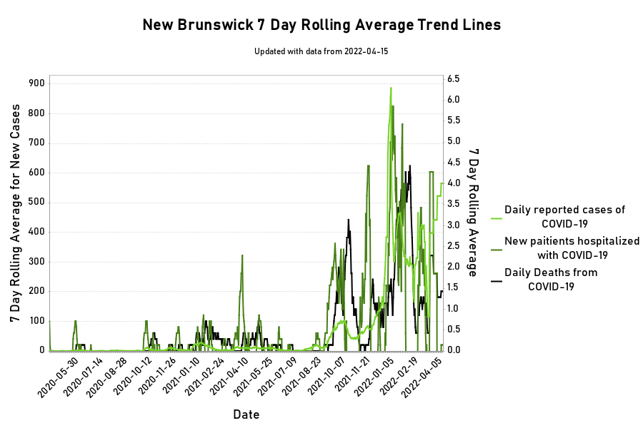
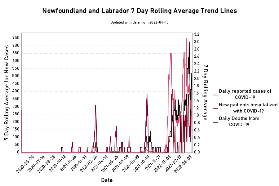
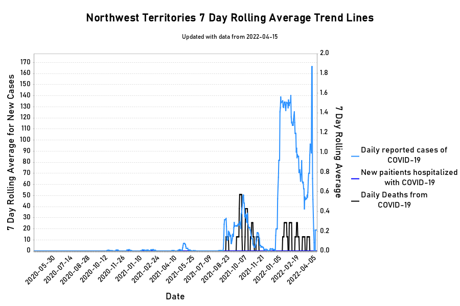
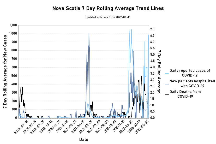
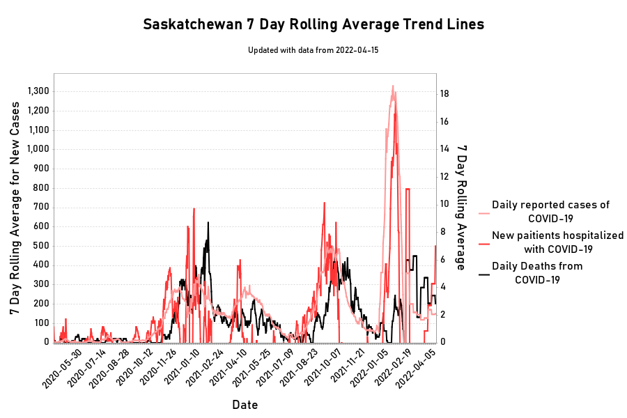
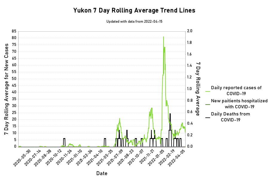
7 day rolling averages for Canadian Provinces
Per Capita Deaths for Canadian provinces.
Per Capita Deaths for selected countries.
The best way to track how we are doing would be a clear picture of the number of cases of COVID-19. Unfortunately the availability of testing and the inconsistent way testing has been applied between jurisdictions makes those numbers difficult to compare and difficult to see how the disease is progressing. We need metrics that are reliably tracked and can show us something meaningful about how we are doing. Better yet we need some that can compare one jurisdiction with another so decisions made by one can be evaluated to help inform the decisions would be best protect citizens.
When I first posted this page I chose to focus on per capita deaths for reasons described below. Even then I think the numbers we really wanted were the number of people in hospital in particular in ICU and the capacity our hospitals had to treat us. I have found some of that data.
By now we have all seen the message that we need to flatten the curve. We often see that represented with a line showing the capacity of our hospitals and a curve of cases over time behind it. We all want that case curve to stay below the capacity of our healthcare system. One hard to expand resource in our hospitals is ICU beds. I am now plotting the official government data on hospitalisations for Ontario and Quebec. Finding the number of ICU beds has proven more difficult. The number in various forms appears in news articles (example from Sudbury.com) and since governments do have plans to expand the number of ICU beds I may well need to use numbers reported that way. At the moment the ICU beds we have are not full so I am using official numbers as reported in 2015 (see Table 1). These numbers match closely with those reported by news outlets as the starting point for ICU beds.
There has been a lot of discussion about testing for COVID-19. Many countries like South Korea and Germany have done a lot of testing and are using those results to guide their response. Other countries like the US have done less testing and were late in making tests available. This means that comparing confirmed cases is not a level playing field, even if we look at it on a per capita basis. I have been discussing this problem with several friends on our closed chat group. Recently I had a brief discussion with my neighbour, across the length of her drive way, about the problem of finding an accurate indicator of how we are doing handling the COVID-19 virus. She is a statistician and she pointed out that one thing that we do track very well as a society is death. That means by tracking the number of deaths in a country we can be reasonably sure the data will be accurate. Obviously in a crisis like this there will be data that is missed or categorised incorrectly but those errors will be small given that most countries already have standards and procedures for tracking the deaths of its citizens. I have chosen to track per capita deaths because it is measured on a per capita basis so you can compare countries of various size.
There are notable exceptions to the accuracy of reporting deaths. Many totalitarian dictatorships have and will be actively misleading their own citizens and the rest of the world. Which is why I will not be reporting on countries that fit into this category.
The down-side of tracking per capita deaths is it is a lagging indicator. If we had consistent criteria and availability of testing across the world we could get an accurate picture of how we are tackling COVID-19 from testing. The per capita death number is an indicator that is two or more weeks behind what an accurate case number would give. Note: I do not know how long behind cases the per capita death measure will actually be.
The choice of countries is somewhat arbitrary. Clearly Italy and Spain have been hard hit. Countries like Germany, South Korea and Sweden have each followed slightly different paths for their response, because of this I am interested in tracking how they are doing. Canada and the US are included because I live in Canada and the US is an important neighbour of ours
The main source of data for these graphs is this Data Repository by Johns Hopkins CSSE https://github.com/CSSEGISandData/COVID-19
You can find direct links to the raw data used in the above graphs here:
Direct link to the global data: https://raw.githubusercontent.com/CSSEGISandData/COVID-19/master/csse_covid_19_data/csse_covid_19_time_series/time_series_covid19_deaths_global.csv
Direct link to the US data: https://raw.githubusercontent.com/CSSEGISandData/COVID-19/master/csse_covid_19_data/csse_covid_19_time_series/time_series_covid19_deaths_US.csv
I got my population numbers from https://www.worldometers.info/world-population/population-by-country/ and the Canadian provincial population number from Stats Canada https://www.statcan.gc.ca/eng/subjects-start/population_and_demography